Interior design is more than just choosing furniture or deciding on paint colours. It’s a thoughtful process that, when done right, harmonises a space, making it both aesthetically pleasing and functional. Designers rely on foundational principles to guide their decisions, ensuring that every room achieves a balance of beauty, comfort, and practicality.
Principle 1: Balance
Balance in design refers to the visual distribution of elements in a space to create a sense of stability.
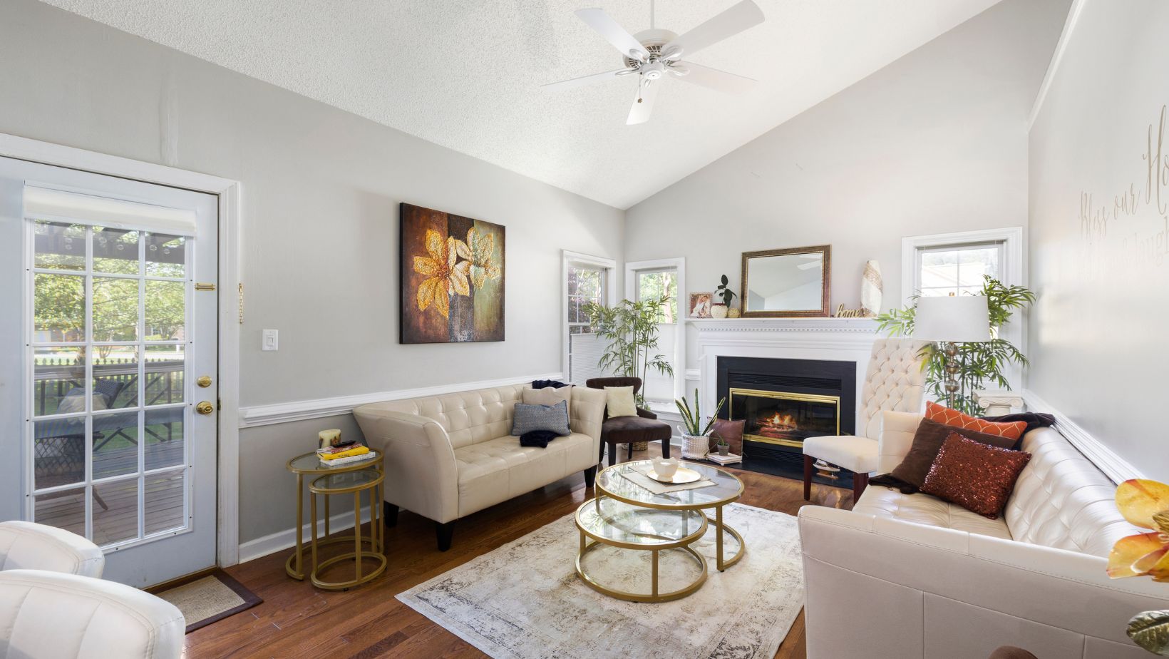
- Symmetrical Balance: The space is divided into two equal parts that mirror each other, giving a formal and orderly appearance.
- Asymmetrical Balance: This uses different but equally weighted elements to create a more dynamic and casual vibe.
- Radial Balance: Elements are arranged around a central focal point, such as a round table surrounded by chairs.
Each type of balance gives a room its distinct feel, whether it’s traditional, relaxed, or bold.
Principle 2: Emphasis
Every space needs a focal point – something that draws attention and anchors the room. A fireplace, a large piece of artwork, or a statement light fixture are common examples of focal points. Once established, the rest of the design complements this focal point without overshadowing it. Emphasis helps guide the eyes naturally through the room, providing visual interest and clarity.
Principle 3: Contrast
Contrast is about creating visual intrigue by combining different elements. Light versus dark, smooth versus rough textures, or large versus small shapes are examples of contrast at play.

This principle is vital for preventing monotony and enhancing the design’s appeal. By layering contrasts, a room becomes more dynamic and exciting, stimulating both the eye and the mind. For example, contrasting herringbone parquet flooring with a textured wool rug enhances this principle.
Principle 4: Rhythm
In interior design, rhythm refers to the repetition of patterns, colours, textures, or shapes to create a sense of movement and flow. This principle is often used to lead the eye from one design element to another, creating cohesion within a space. You can achieve rhythm through repetition (repeating the same elements), alternation (rotating elements in a sequence), or progression (gradually increasing or decreasing the size or colour of elements).
Principle 5: Proportion and Scale
Understanding proportion and scale is critical to ensuring that all elements in a room feel cohesive and in harmony with each other. Proportion refers to the relationship between the sizes of different elements. Scale refers to how the size of one object relates to the overall size of the room or space. For example, a large chandelier in a small room may overwhelm the space, while a small piece of art on a large wall may feel insignificant.
Successful design balances the scale and proportion of items so that they feel naturally suited to the room.
Principle 6: Harmony and Unity
Harmony and unity tie a room’s elements together into a cohesive whole. While contrast brings excitement, harmony ensures that the space feels visually unified. This can be achieved by using similar colours, textures, and patterns throughout the room, creating an overall sense of consistency. When each component feels like it belongs together, the space exudes calm and order.
Principle 7: Details
Design is often in the details. Small elements like trim, finishes, and accessories might seem insignificant on their own, but together, they elevate a space from ordinary to extraordinary.

From the texture of throw pillows to the type of hardware on cabinetry, every detail plays a role in supporting the overall design theme. Even the smallest decisions, like door handles or lamp switches, can significantly impact the feel of a room.
Applying the Principles to Your Space
- Start with a focal point: Choose one standout element for the room, and design around it. It could be a large painting, a stunning view, or even a unique piece of furniture.
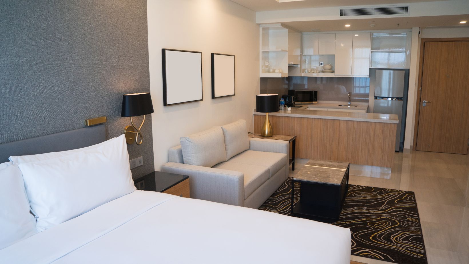
- Balance the elements: Arrange your furniture, décor, and colours to create a sense of stability. Ensure your design doesn’t feel lopsided or too heavy on one side.
- Layer textures and contrasts: Introduce a variety of materials and finishes, like mixing metals with wood, or combining soft fabrics with hard surfaces, to bring depth to the space.
- Use repetition and rhythm: Repeat patterns, colours, or shapes throughout the room to create flow and harmony. For example, repeat a colour in your cushions, curtains, and rugs.
- Scale furniture to fit the room: Ensure that your furniture and décor are proportionate to the size of the space. Oversized furniture in a small room can make it feel cramped, while too-small furniture in a large room may feel awkward and out of place.
By adhering to these principles, you can create spaces that feel well-thought-out, balanced, and, most importantly, designed to reflect your personal style.

